




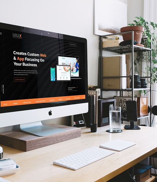

A website needs to work well on every device. Today, people browse websites using smartphones, tablets, laptops, and desktop computers. If a website looks good on one screen but becomes difficult to use on another, visitors may leave quickly. This is where responsive web design becomes important.
Responsive web design allows a website to automatically adjust its layout, images, text, menus, and other elements according to the user's screen size. It creates a consistent and seamless browsing experience across different devices.
For businesses, this is more than a design trend. A responsive website can improve usability, engagement, accessibility, and overall customer experience.
What Is Responsive Web Design?
Responsive web design is an approach to website development that allows a website to adapt to different screen sizes and devices.
Instead of creating separate websites for desktop and mobile users, a responsive website uses flexible layouts and design elements. These elements automatically adjust based on the available screen space.
For example, a three-column desktop layout may become a single-column layout on a smartphone. Images can resize automatically, while menus can change into mobile-friendly navigation.
This approach makes websites easier to use across smartphones, tablets, and desktop computers.
Why User Experience Matters
User experience refers to how visitors feel when they interact with a website. A good user experience makes it easy for people to find information, navigate pages, read content, and complete actions.
Poor website usability can create frustration. Visitors may struggle with small text, difficult menus, slow pages, or content that does not fit their screen.
A user-friendly website removes these problems. Responsive web design helps create this experience by making website content accessible and usable across different devices.
When visitors can easily interact with a website, they are more likely to explore additional pages and engage with the business.
Better Mobile User Experience
Mobile users are an important part of modern website traffic. People often use smartphones to search for businesses, compare products, read information, and make purchases.
A desktop-only website can be difficult to use on a small screen. Visitors may need to zoom in, scroll horizontally, or repeatedly adjust the page.
A mobile responsive design solves these issues. Content automatically fits the screen, buttons become easier to tap, and navigation becomes simpler.
This creates a better mobile user experience and allows smartphone users to browse without unnecessary effort.
Improved Website Navigation
Navigation plays an important role in user experience. Visitors should be able to find important pages without confusion.
Responsive websites can adjust navigation according to the device being used. Desktop users may see a full navigation menu, while mobile users can use a compact menu.
This makes mobile navigation easier and reduces unnecessary scrolling.
Simple website navigation also helps visitors reach important pages such as services, products, contact information, and blog content.
Better Readability Across Devices
Text that looks comfortable on a desktop may appear too small on a smartphone. Users may need to zoom in, which creates a poor browsing experience.
Responsive layouts can adjust font sizes, spacing, line lengths, and content width according to the screen.
This improves website readability and makes long-form content easier to consume.
Proper spacing also prevents buttons and links from appearing too close together. This is particularly important for touchscreen users.
Faster and More Efficient Browsing
Website performance has a direct connection with user experience. Visitors generally expect pages to load quickly and work smoothly.
Responsive design can support better mobile website performance when images, layouts, and other elements are properly optimized.
Developers can use optimized images, efficient code, caching, and other performance techniques to reduce unnecessary loading.
A faster website allows visitors to access information without waiting. This can improve engagement and create a smoother browsing experience.
Businesses planning a new website can also consider custom web development when they need a responsive solution built around specific requirements.
Better Cross-Device Compatibility
People do not always use the same device throughout their online journey.
Someone might discover a business on a smartphone, research it later on a tablet, and complete an inquiry using a desktop computer.
Cross-device compatibility helps provide a consistent experience during this journey.
A responsive layout keeps important content, branding, navigation, and functionality consistent across different screen sizes.
This creates a more reliable digital user experience.
Responsive Design Supports Accessibility
Website accessibility means making digital content easier to use for people with different needs and abilities.
Responsive websites can support accessibility by providing readable text, appropriate spacing, usable navigation, and flexible layouts.
A responsive design can also work alongside accessibility practices such as proper heading structures, descriptive links, keyboard navigation, and suitable color contrast.
When accessibility and responsive design are considered together, more users can interact with a website comfortably.
Better Engagement and Lower Friction
A website should make it easy for visitors to take action.
Whether the goal is submitting a contact form, purchasing a product, booking a service, or reading an article, unnecessary obstacles can reduce engagement.
Responsive web design reduces friction by ensuring important elements remain visible and usable.
For example, a responsive ecommerce website can make product images, descriptions, pricing, and checkout buttons easier to access on smartphones.
Businesses can also explore different ecommerce solutions before development. Resources discussing shopify vs woocommerce can help businesses understand how different platforms approach ecommerce functionality.
Responsive Design and SEO
Responsive design can also support a website's SEO strategy.
Search engines need to understand and access website content efficiently. A mobile-friendly website provides users with a better experience on smartphones and makes it easier to maintain one consistent website structure.
Website performance, usability, mobile compatibility, and content accessibility can all contribute to a stronger overall website experience.
However, responsive design alone does not guarantee higher search rankings. It should be combined with technical SEO, quality content, strong website architecture, and proper optimization.
Responsive Design for Ecommerce Websites
Ecommerce businesses have even more reasons to prioritize responsive design.
Online shoppers may browse products from their phones while commuting, during breaks, or at home. If product pages are difficult to navigate on mobile devices, customers may abandon their shopping journey.
A responsive ecommerce website can adapt product grids, images, filters, menus, shopping carts, and checkout pages to smaller screens.
Businesses comparing ecommerce platforms can also research shopify vs woocommerce vs magento to understand which platform may fit their requirements.
The right platform and responsive design approach should work together to provide a smooth customer journey.
Responsive Websites Can Improve Conversions
Good user experience can support conversions because visitors can complete actions more easily.
A responsive website makes important conversion elements accessible across devices. Contact forms, call-to-action buttons, product information, and checkout options can all be designed for different screen sizes.
However, conversion rates depend on many factors, including pricing, trust, content, offers, website speed, and product quality.
Responsive design is one important part of creating a friction-free experience.
Businesses should also understand their overall website development cost before beginning a project. Planning the design, features, content, integrations, and responsive requirements in advance can help create a more realistic development budget.
Responsive Design vs Other Website Approaches
Businesses may encounter different website development approaches when planning a new project. For example, researching static vs dynamic websites can help explain how different types of websites handle content and functionality.
Responsive design is not necessarily an alternative to static or dynamic development. A static website can be responsive, and a dynamic website can also use responsive layouts.
The key difference is that responsive design focuses on how the website adapts to different screen sizes and devices.
This makes it an important consideration regardless of the underlying website technology.
Best Practices for Responsive Web Design
Businesses and developers should consider several practices when creating responsive websites:
- Use flexible layouts and grids.
- Optimize images for different screen sizes.
- Make buttons easy to tap on mobile devices.
- Keep navigation simple.
- Use readable font sizes.
- Test pages on smartphones, tablets, and desktops.
- Improve page loading speed.
- Maintain consistent branding.
- Follow accessibility best practices.
- Regularly test the website after updates.
These practices help create a website that feels natural to use across different devices.
Conclusion
A website should provide a smooth experience regardless of the device a visitor uses. Responsive web design helps achieve this by adapting layouts, navigation, content, images, and interactive elements to different screen sizes.
It can improve mobile user experience, website readability, navigation, accessibility, performance, and cross-device compatibility.
For businesses investing in a new website, responsive design should be considered from the beginning rather than added as an afterthought. When combined with good UX principles, quality content, SEO, and strong development practices, it can create a more useful and engaging digital experience for visitors.
Whether you are building an ecommerce store, business website, or custom web application, designing for multiple devices helps ensure that your website remains accessible and user-friendly as customer browsing habits continue to evolve.